Tuesday, December 29, 2009
Friday, December 11, 2009
Thank You...

To Amanda Williams and the Class of 2009. Seasons Greetings....
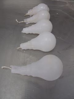
Thank you for the memories, we made an invaluable archive, (having written to Amanda) it seems we are free to use the blog. If any one is interested in keeping in touch through the blog about exhibitions etc, that would be cool. Stay safe and happy for the interim, remembering always, it is but a dream. Here above, is a reminder of what next year may at some stage become.
Tuesday, November 10, 2009
Collaborative arts


sorry so late.
I went researching collaboration art and found a great website from the blog http://collabarts.org/?cat=7 From our review i was really interest in Christo and Jeanne- Claude which have been apart of the kaldor art projects. I love this pairs work as i find collaboration art really powerful, bringing together ideas from two artists to create something of significance. Collaborations are more interactive and tend to been more powerful on an audience with the combining of resources as seen by Christo and Jeanne- Claude.
Christo and Jeanne-Claude
Wrapped Trees, Fondation Beyeler and Berower Park,
Riehen, Switzerland 1997-98
Photo: Wolfgang Volz, ©Christo 1998
Christo and Jeanne-Claude
The Umbrellas, Japan - USA, 1984-91
Photo: Wolfgang Volz ©1991 Christo
Sunday, November 1, 2009
Art and Globalism: Alfredo jaar
 Alfredo's Instillation 'Geography=war 1991' Jaar projects photos taken of a small village in Nigeria. the images depict children who play with barrels of toxic waste left around their village in the waste dumps by italian tankers. in this instillation Jaar explores the affect of global waste on the environment and people. and attempts to give a face to the impersonal global forces that create these horrible conditions.
Adrian Piper :Art and Identity

Saturday, October 31, 2009
Art + Institutions
Challenging the object value systems and consumer driven society we perpetuate, Hill also questions the level of interaction the gallery space and it's staff have upon a work (significant in this case, the work having utilized a number of the chairs). In a larger sense, Hill questions the nature and structuring of the art institution globally; to what extent is art of any use if it is not universally accepted? In which case, why make art?
Friday, October 30, 2009
Broken Homes: Andrew MacKenzie
Art & Politics: Raquel Ormella

I reviewed Raquel Ormella's Artspace exhibition for our assignment but thought I would talk about some of her other works currently on show at the MCA as part of Making It New: Focus on Australian Contemporary Art. I'm worried this will become a slogan comprises 9 fabric banners, each hand appliqued with text on both sides. On one side of each banner the text describes people of strong political convictions, while on the other Ormella expresses her insecurities about her own activism, wondering "Is it enough?". The stitching that shows through from the other side quite cleverly expresses the idea of a thought that plays on the back of the mind coming to the surface; something that one can't quite shake. Ormella is examining the role that political beliefs play in shaping personal identity. The hand sewn works reference protest banners, their craftmanship particularly bringing to mind the protests of the suffragette movement.

I’m worried this will become a slogan 1999–2009
double-sided banners, sewn wool and felt
9 banners, sizes various
Art and Politics

Satire always brings out interesting caricatures!
Art & Its Institutions: PIE

spat+loogie (Kat Barron and Lara Thoms) are a Sydney(ish)-based duo who's performance work, PIE, is showing as part of Primavera 2009 at the MCA. In the work, members of the public are invited to sit down with an artist or curator over a piece of pie and enter into a dialogue about art . A "menu" of conversation pieces is provided which topics such as the Shaun Gladwell-referencing "Is skateboarding art if you slow it down?". At the end of the conversation the participant may then share the pie with the art professional or throw it in their face.
Art & Audience

Thursday, October 29, 2009
Art and Architecture

Selfridges is a shopping centre in Birmingham designed by Future Systems. The building as a whole looks pretty ugly, however when you're up close the aluminium discs are amazing to look at! The buildings structure has an organic flow, flaring out at the top and base of the building whilst being drawn in at the middle. The reflective capabilities of the domes gives the building a sense of life and colour.
Tuesday, October 27, 2009
art & architecture...a family story
But Heinz, he was of couse an archictect by proffession, he designed and built hotels through switzerland and germany. But at heart his artistic side could not be ignored or hiden, not even in his profession, every single design that was subsequently constructed had his own signiture. A stain glass window. Each one unique in design. In fact the last stain glass window that he made is at his house with his wife, as far as i know i believe it is the french doors that lead out to the garden. I wish i had photos or something to show of his work, because this man, his work was truely amazing, and although his "real job" was that of an architect, i believe that the creativity and pull of a true artist always shines through regardless of whether one is accepted or known as a practicing artist... if i have the chance to get to germany, hopefully next year, i will be documenting Heinz's works...
Art & Globalism - Allan Sekula
ps... very sorry but it would seem that all my technical devices are s**ting themselves thus not allowing me to post images...if i could fix it i would...honestly far too close to re-decorating with a hammer! sorry.
Art & Spirituality – Gordon Matta-Clark’s Descending Steps for Batan (1977)
The work of Gordon Matta-Clark appears perhaps more obviously suited to discussion in the context of Art & Architecture. Descending Steps for Batan is a performance/document carried out by Matta-Clark in 1977 in response to the suicide of his brother, Sebastian Matta, a painter who suffered from mental illness. For the duration of the exhibition, Matta-Clarke dug into the ground beneath the gallery floor, carving out a rudimentary flight of descending stairs. The dirt steps led downward but nowhere in particular, their final destination arbitrarily decided by the end of the exhibition period. Afterwards the hole was filled in. Descending Steps is one of my favourite of Matta-Clark’s works. Often it seems that much of what is described as spiritual in art exists on a grand, all encompassing scale. Matta-Clark’s simple work describes overwhelming loss and guilt, and I feel it is just as effective. To me, this hole in the floor speaks of transcendence.
Figure 1: Gordon Matta-Clark, Descending Steps for Batan (1977), Cibachrome 40 x 30 in.
Collaborative artists: Stelarc and Nina Sellars


This collaboration titled blender, was first on exhibit in 2005 at the melbourne meat market gallery. The work consists of a large 1.6 meter high blender with a dome industrial casing.
Monday, October 26, 2009
Art and the Audience- Olafur Eliasson

I thought it appropriate to talk about Olafur Eliasson for art and the audience, seeing as his works are coming to the MCA!
I particularly love the Weather Project.
The weather project was installed at the London's Tate Modern in 2003 as part of the popular Unilever series. The installation filled the open space of the gallery's Turbine Hall.
Eliasson used humidifiers to create a fine mist in the air via a mixture of sugar and water, as well as a semi-circular disc made up of hundreds of monochromatic lamps which radiated single frequency yellow light. The ceiling of the hall was covered with a huge mirror, in which visitors could see themselves as tiny black shadows against a mass of orange light. Many visitors responded to this exhibition by lying on their backs and waving their hands and legs. The work reportedly attracted two million visitors, many of whom were repeat customers.
I suspect that seeing something like this would be life changing. Not only does Eliasson literally include the audiences image (through the mirror on the roof) but he almost makes the viewer transcend or rise above themself with this synthetic creation.
I cant wait to see his exhibition!
Mitsuru Koba- Art and its Audience


I stumbled across this artist,on a Scapbooking website!! He shaped and polished river stones collected from dried beds, in apparently site specific bundles. Recently he installed driftwood dinosaur skeletons on causeways around inlets in Japan, the layers of uncovered earth provide a readymade "white cube" and he really puts a haunt into it. I identify with this collection/hording, site specificity/ love of animals.
REVIEW Due DATE
Sunday, October 25, 2009
Friday, October 23, 2009
Self Directed Project....
unable to label old posts
I am unable to label two of my old posts; art and the collaborative and art and the body. I have emailed you, but I suspect the address is wrong.
I have tried many different ways for over 45 minutes to no avail.
What would you like me to do?


